Shutterfly Responsive Timeline
Shutterfly
2016-2017
This project was more than a redesign—it was the first element in a responsive-component future
I paired up with the Director of Product to envision a componentized future for Shutterfly, starting with the photos service. Along the way, I helped get executive buy-in, mapped out a design strategy, ideated on conceptual models, and mentored an early-career designer. The responsive photo service enabled the photos business to grow and laid a foundation for simpler personalized product creation.
Role:
Senior Manager
Hands-on with interaction and architectural models
Team:
Sr. UX Designer x 2
Photos Product Team
Collab with our Engineering Partners

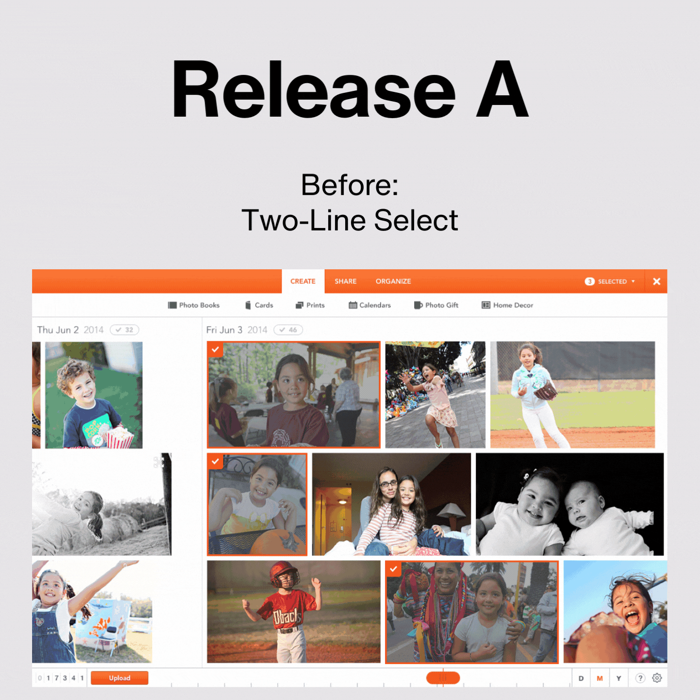
Shutterfly’s horizontal timeline was well-loved on a desktop, but it didn’t translate to mobile.
In 2016 the future was mobile, and the Shutterfly site wasn’t ready. All of our pages were desktop-optimized, which was an increasing problem as we sent out emails with links to photo memories. It was clear our horizontal interface needed to go vertical.

We thought modularly…
I framed out logical releases and built up a design strategy for the year.


We narrowed our design work down to two concepts, and tested them.
By the end of 2017 we released three of our major phases.

Most importantly, our customers were able to view all their photos on their phone.
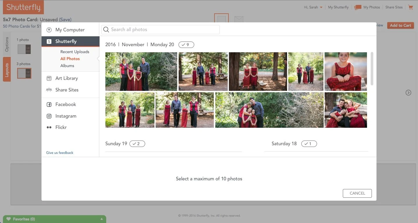
In 2017 the Photos component replaced Shutterfly’s former clunky photo picker. The component was performant, optimized, and the end user now had a familiar, consistent experience.